|
|
When Doug Bartow was interviewed for a job at the Massachusetts Museum of Contemporary Art in late 1994, the museum was still waiting to be certified for state funding. He had no guarantee that the position would still exist the following spring, when he expected to complete his graduate studies in design at the prestigious Cranbrook Academy of Art in Michigan.
“I made a proposal to be director of design, handle all the signage, build the website, and do all the print material. I got the job and then finished school. I left Michigan on a Friday in May and started here on Monday. I was the fourth person to join the staff. Director Joe Thompson, Jennifer (Trainer), and Paulette (Wein) were the others.”
“We had just been approved for the money. The buildings were in rough shape. You could smell the mildew. We had space heaters, and I used my own computer for the first eight months. I didn’t know what art we were going to have or what the place was going to look like when it was finished.”
When I asked Bartow if that made his new job all the more difficult, he looked at me incredulously.
“Are you kidding? That was the beauty of it. It was a designer’s dream. I had a creative blank slate.”
Bartow, 34 years old, is married and has two young boys. He was born and raised in Syracuse, New York. When he was in high school, he had a knack for designing things, so he always got asked when there was a school event that needed a sign. He recalls that his first project was cutting and pasting some promotional stuff for his high school band. But he didn’t consider design as a career choice.
“I was good at math and science. I had mechanical skills. My father was a landscape architect, and he knew some engineers. My guidance counselor recommended engineering as a career. It seemed like the thing to do.”
He enrolled at the engineering school at Rensselaer Polytechnic Institute in Troy, New York. It turned out to be a bad decision.
“I hated it. After my freshman year, I took a year off and signed up for a few art classes at the University of Albany. I ended up getting an associate’s degree in design at the Junior College of Albany.”
Bartow went on to get his bachelor’s at the State University of New York at New Paltz, and then landed a job as a freelance designer with an advertising agency back in Albany. Finding it “creatively unfulfilling,” he applied and got accepted to Cranbrook.
“Cranbrook provided a very open experience. Students were encouraged to propose their own projects and agenda. And they’re famous for breaking all the rules.”
That non-traditional experience served him well when he arrived at the equally non-traditional campus at Mass MoCA. His first task was to create an identity for the museum.
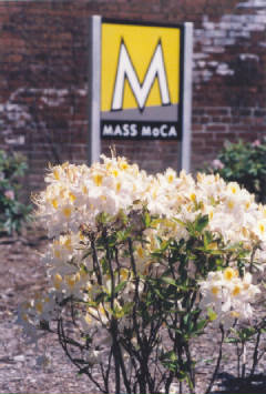
“It took me a while. I started with the logotype, which is MASS MoCA, just the eight letters. We were looking for something that was modern and forward-looking, but not futuristic. We wanted a mark that was timeless. I was screwing around in a font program mixing things together, and I came up with it. It’s very similar to Futura Medium, which is the well-known Paul Renner design from 1927. That design is based on the Bauhaus ideal that ‘form follows function.’ I never bought into that brand of modernism in design, so I thought altering the letterforms slightly would be fun. We used the new logotype exclusively for a while; it was good for simple projects. We had the letterhead and business cards, and we did a stationery/card package.”
At that time, the task of raising funds, working with the architects and contractors, and searching for available art was a shared responsibility.
“We did a few events in ’95, like a dance festival with Jacob’s Pillow in the courtyard. With only four people on the staff, I was literally selling ice cream, as well as hats and T-shirts.”
Once the site was renovated and the galleries were ready for the opening in 1999, the design work took on added importance and broadened in scope. That’s when Bartow got to work on what has become his most noticeable creation: the MASS MoCA sign atop Building 12.
“I had seen photos of the old Sprague sign up there. That was my starting point, but the style of their sign didn’t say enough about how we planned to re-use the site. When I took the new logotype I had, and cut the letters out and put them on a scale model of the building I built, I knew that was it. I think the idea of appropriating Sprague’s roof sign and putting ours there was a nice little transition. It was sort of like the deli went out of business, and the new one came in. The decision to keep the back side of the sign unfinished, and the structural elements in plain view went along with MASS MoCA’s mission of being a work-in-progress ourselves.”
Anyone who has walked around with one of those stickers on their shirt, or has a souvenir magnet on their refrigerator will recognize the crooked “M,” which has become North Berkshire’s most familiar symbol. Bartow says he simply got tired of using the eight horizontal letters. “I had this one view of an oblique look at the letter from the model I built, and I thought it looked interesting. The image itself was at first a mistake. I had snapped it to use up the rest of the roll of film.”
As the date of the grand opening grew nearer, the overriding priority was to create signage to lead people to the museum, up to the ticket desk, through the galleries, and even to the bathrooms. That presented a daunting challenge to Bartow.
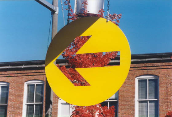
“When it comes to way-finding and environmental design, it’s difficult with this site, because Arnold and Sprague built it for people to park in the parking lot, know where they are going, and walk to their workplace. We’ve gotten a lot of use out of those yellow arrows. I would rather have those than a big sign saying, ‘Entrance.’”
As any visitor will tell you, the museum retains that factory look.
“Some of the signs that were left here were just painted on brick. If you go into Building 1, you can still see some of the old plywood prototype signs that I made. It was about bare wood, aluminum, and simple hardware. It wasn’t about clean, futuristic Formica. But it didn’t end up working well in the galleries. When the new hardwood floors got finished, you could see that the plywood signs and the floors were indistinguishable.”
“One of the materials that the architects were using was blue steel. They used in the entryway, and the elevator is clad in it. It’s really beautiful. Take a look at the Lickety Split sign, or the sign above the information desk. It’s just a piece of blue steel with two holes in it. We hung it with a big piece of chain, and put some vinyl lettering on it. The materials are inexpensive. It compliments the unwashed, unpainted walls, and the raw timber in the galleries.”
“It was out of necessity. We didn’t have the manpower or budget to put together a huge signage package. I went to the Museum of Science in Boston and looked at their interior lit signage and realized that what they were spending on one sign, I had to spend on 30 signs.”
On a shelf outside of his office, there are two somewhat similar signs sitting side by side, one made by Bartow, the other by Sprague. He radiated enthusiasm as he showed them to me.
“Just look at this Sprague sign. It’s much more beautiful than the one I made. That’s because it was not made by a designer. It was just made by someone who worked here. There’s a lot of stuff leftover here that Sprague didn’t want. The buildings were chock full of found-art things that we’ve used or worked from. Creative re-use has always driven the aesthetic of this place.”
One of the items at Hardware (the gift shop) represents the eclectic designer’s first attempt at making jewelry.
“Someone gave me 10,000 pieces of Sprague capacitors. I was just messing around and wound up making earrings out of them. I took them down to the store, and the manager said, ‘Make me 12 of these, and we’ll see if they sell.’ Those capacitors are beautiful. Look at the box they came in. It’s clear and says Sprague on it. It was designed to hold capacitors for sale at trade shows. I love the idea of reusing the original packaging for the earrings.”
Last summer, Bartow designed some umbrellas for the tables in the front courtyard.
“My mentality is always, ‘Let’s do it ourselves and make it our own.’ We took our old banners from Game Show and Unnatural Science and cut them into triangular shapes and had umbrellas fabricated from them for our outdoor cafe. I was really pleased with how they came out. You could never convince me that stock umbrella vinyl is nearly as interesting as reusing vinyl we produced to promote our shows and exhibitions. It creates a sort of abstracted record of some of the events we have done to date.”
Despite the growth of the museum and its staff in the past three years, everyone is still expected to pitch in when the pressure is on.
“We may have titles, but any of us can be a director of something around here for an hour. The Robert Wilson show (14 Stations) is a good example. That’s the kind of thing where we really come together as a team. We had 90 tons of rocks to install. On the night before it opened, everyone was here. It was way after midnight, and somebody yelled down, ‘Bring me the glue gun. I need to glue the tongues on the wolves.’ I went home for a few hours, and then I was back here early in the morning putting up the signs and labels.”
Bartow notes that his job continues to be very challenging.
“I’m looking forward to it. There’s a bunch of projects on the horizon that I see as huge amounts of work. But will I be dreading it? Not at all.”
|
|

